Diamond Comparison Feature
Summary
Enabled users to easily compare diamonds based on key attributes. This feature enhanced the purchasing experience by empowering customers with the tools to make informed decisions in their diamond selection.
Responsibilities
User Flows
Testing
Product Design
Prototype
Blue Nile
Problem
How do we help the user find the diamond that is right for them and how will they know it's the right one?
Goals
- To provide a consistent and effective way for customers to easily view real images of diamonds.
- The solution needs to be easily implemented across our vendors in a consistent format.
- The solution should encompass 360-degree images, while providing definition/education to easily understand exactly what the images mean. Providing streamlined education opportunities (ex: information around what the image are illustrating).
Constraints
- Deadlines – the first iteration has to be up and available to customers quickly.
- Relative sizing.
- Capacity on the development teams within the given deadline.
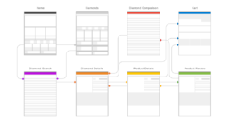
User Flows
Trying to understand the touch points for where this feature could live.
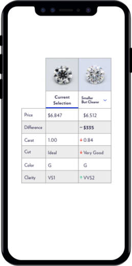
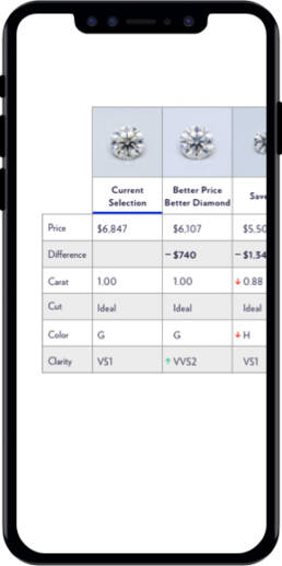
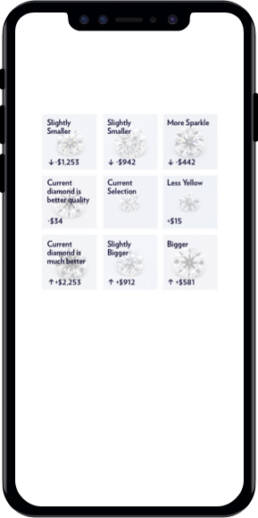
Testing Mobile
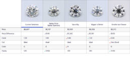
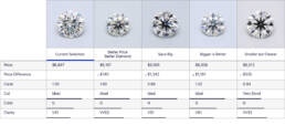
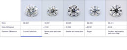
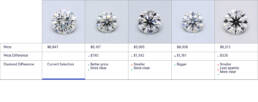
We took 4 variants into testing to see how users would perceive the differences, which one would help them find the right diamond the fastest, and how effective each design was.
Testing Desktop
The 4 desktop variants were taken into testing to see which indications of quality worked best for the user.
Final Visuals and Prototype
I did a final prototype so that development could see how I wanted the interactions to occur on hover.
Future Recommendations
- Look at starting with a simple description, with expand capability to full details.
-
Scannability is a top concern.
-
Evaluate sticky rows on small.
-
Look for ways to simplify design.
-
Figure out diamond images.


