

Automotive Checkout Experience
Summary
At Fair, I helped launch the first end-to-end automotive checkout experience, contributing to the design of intuitive and scalable solutions that enhanced the customer journey. After Shift's acquisition of Fair, I focused on creating user-centric experiences for the online car marketplace.
Summary
Product Design
Information Architecture
Research
Design Systems
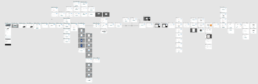
User Flows
Prototypes
Taking on an age-old industry
They’ve been around for decades, but are customers enjoying the experience?
Have you ever sat at a dealership for hours filling out paperwork and trying to understand what's taking so long? Did you lack the transparency you were expecting on what you were going to paying monthly and why?
Problem to be solved
Allow the customer to purchase a car online and reduce costs by eliminating the need for one-on-one consultation.
Reduce the overhead cost of selling cars
Allow the customer the freedom to purchase when/where they want.
Support for quick launch with fast-follow meaningful updates.
Allow the ability to self-correct when errors occur.
Customer's success is our success.
Every decision we made was guided by this. How do we make it a seamless experience for the user and help them self-correct when it’s not perfect?
This led to a drastically simplified design and layout.
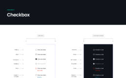
Evolving the design language
While building the experience at Fair, I was continually adding items to Fair’s Design System. This was worked on jointly with the Design System Guild which consisted of designers, developers, and researchers.
The project morphed from Fair to Shift. Taking on the new branding as well as a much more mature design system. My role transformed a bit as well, allowing me to focus on the process of adding and iterating on Shift’s design system (Gearbox).
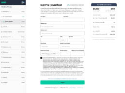
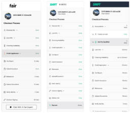
Setting Expectations
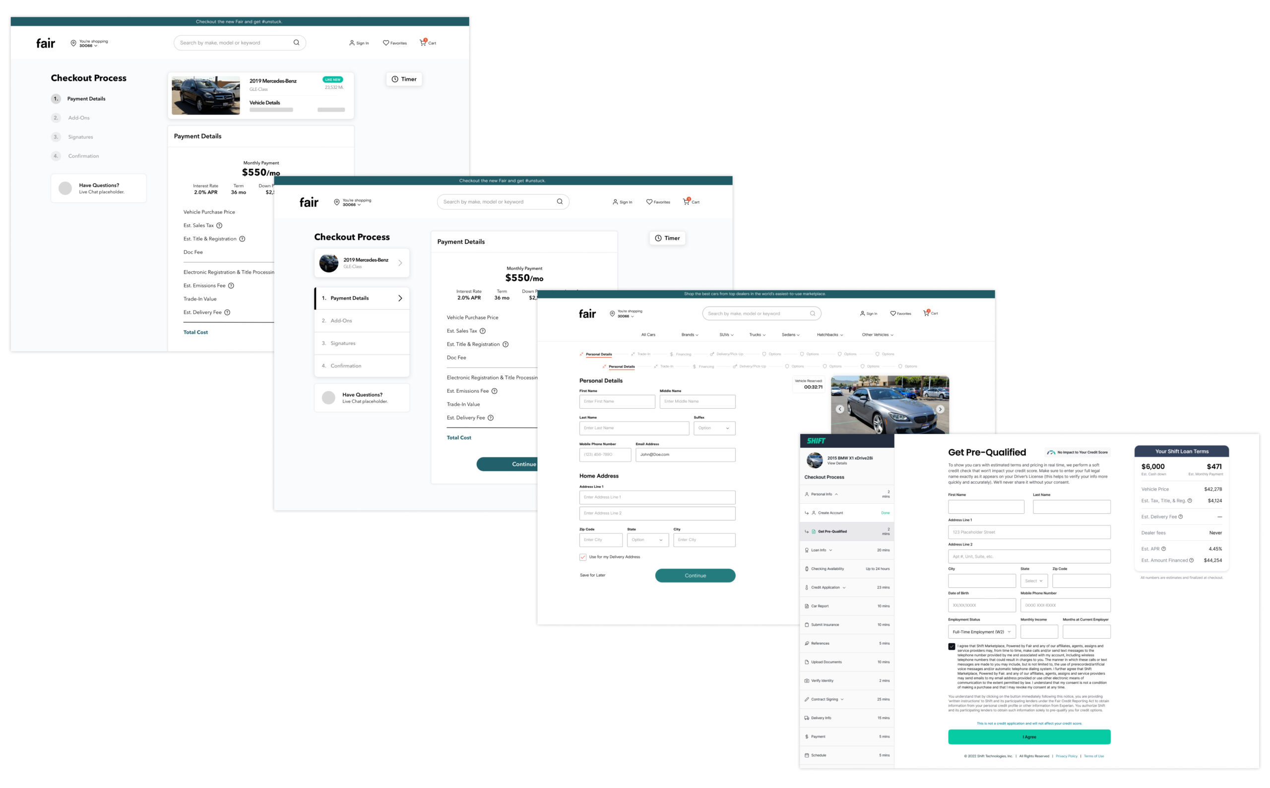
One of the main things we tried to accomplish was giving the user complete transparency of where they were in the process, what they could expect next and what they would need moving forward.
This was mainly accomplished by the left-hand navigation, it went through multiple iterations, but ended up in a spot that allowed us to remove the header and give that real estate back to the content area.
Evolving the design
I had to take what Fair had done in the past and evolve it taking into account a new brand direction, design system, and new brand team. This allowed me to simplify the experience and use patterns that are common across the web in order to help the user understand what to do next.
Don't tell, show
When working on new interactions, a prototype can be worth a thousand words. I built some prototypes of how I wanted specific interactions to occur. This was mainly for look, feel and timing.
Sweat the details
This is the difference between a polished product and a disjointed experience. I value putting out clean products that users enjoy and I believe that these fine details are perceived by the user if they are out of place or slightly off.